Researched the target audience, reframed the product strategy, and delivered a high-fidelity prototype as the sole UX/UI Designer on a four-week client engagement.
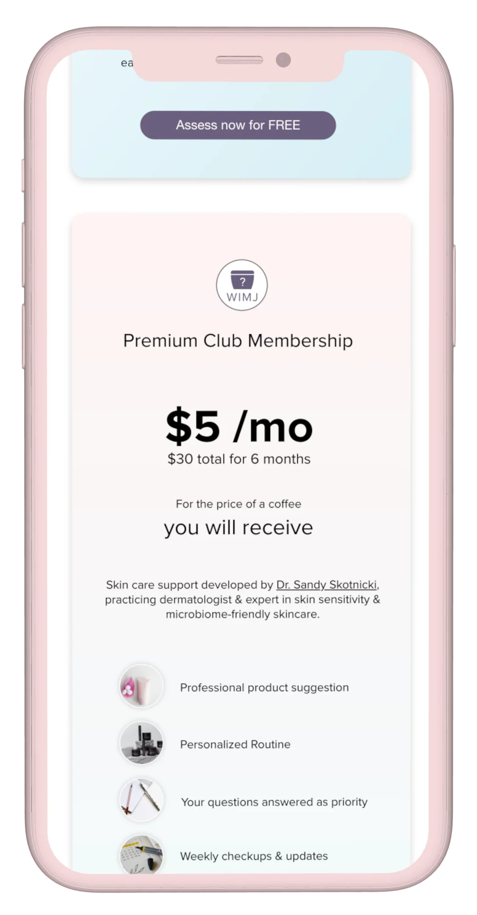
Working directly with the founder, I was asked to improve member sign-ups. Research uncovered information architecture and visual design issues that were straightforward to address. The larger opportunity was audience reach: expanding beyond college students to include older skincare enthusiasts and influencers could significantly broaden the potential member base. This insight reframed the product strategy and shaped the redesigned prototype.
80% of visits came from mobile, where dense data and narrow funnels were driving people out before they converted. Rather than assuming the existing product direction was correct, I evaluated the target market, customer behaviors, and competitive landscape to better understand who the product should serve. The research wasn't simply about improving usability. It helped redefine the primary audience and identify opportunities to align the product with both user needs and business goals.
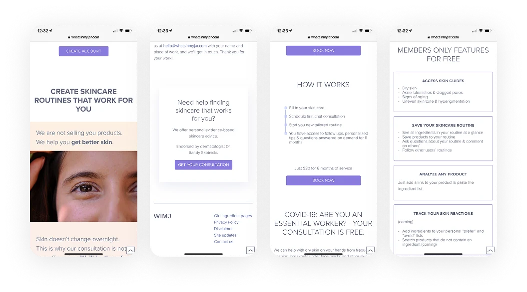
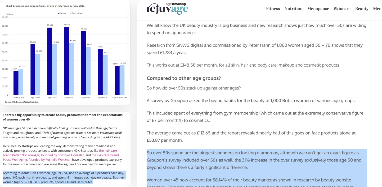
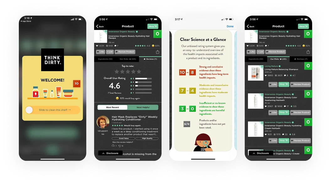
How research reshaped the product, from audience strategy to information architecture and growth.
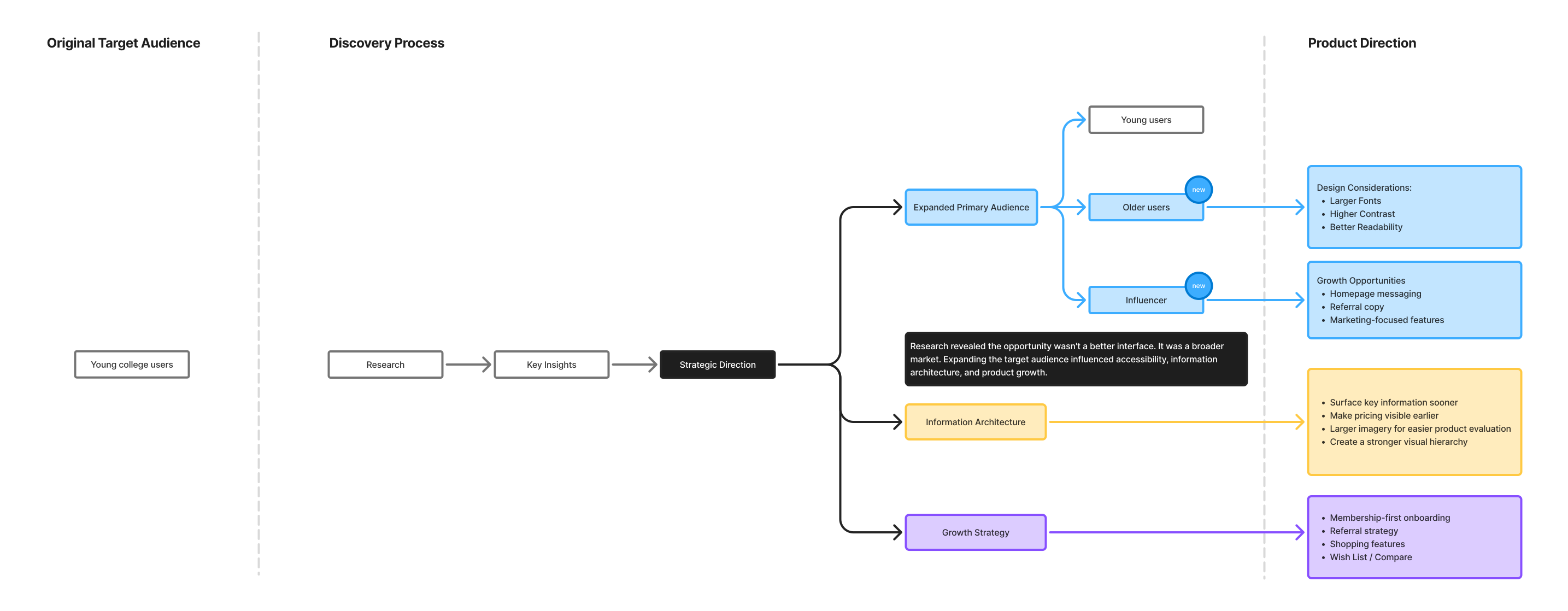
Research uncovered both usability issues and broader opportunities, shaping the information architecture, audience strategy, and approach to membership growth.
The biggest insight wasn't about the interface.
Expanding the primary audience changed much more than the visual design, it reshaped information architecture, accessibility, feature priorities, and growth strategy.
The interface became the result of solving the right product problems first.
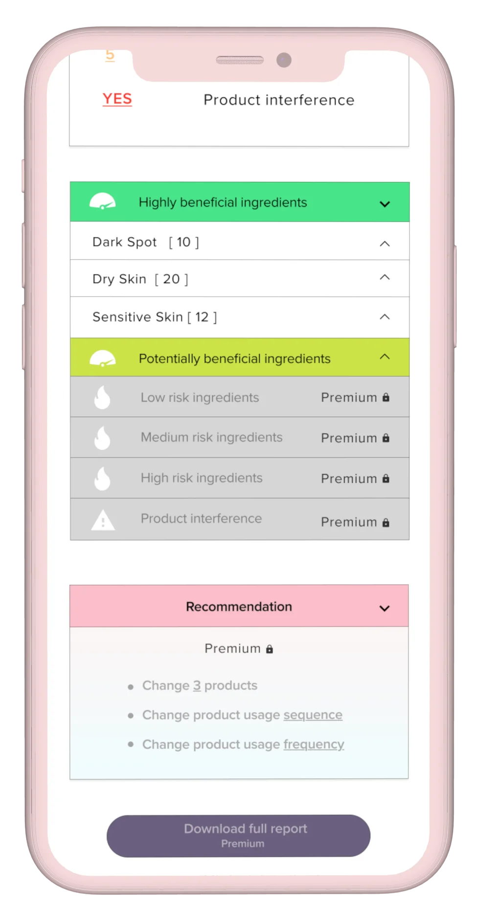
Guided by the revised product strategy, I redesigned the experience for three audiences: college-age users, mature skincare enthusiasts, and influencers. A major UX improvement was routine registration. The original flow required users to add each product twice daily for seven days, totaling more than 100 actions for a typical routine. The new flow requires each product only once.
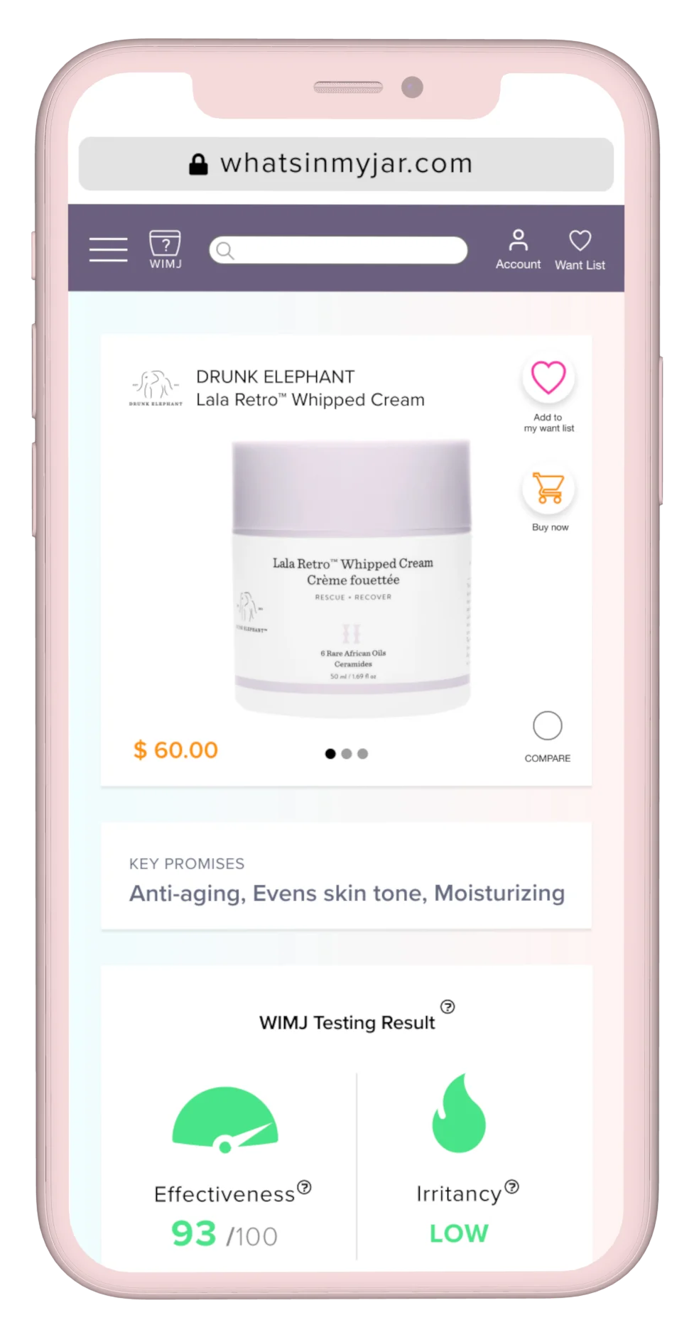
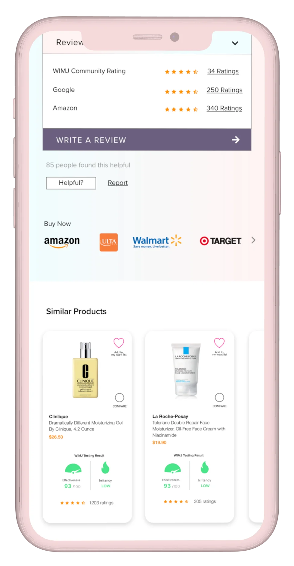
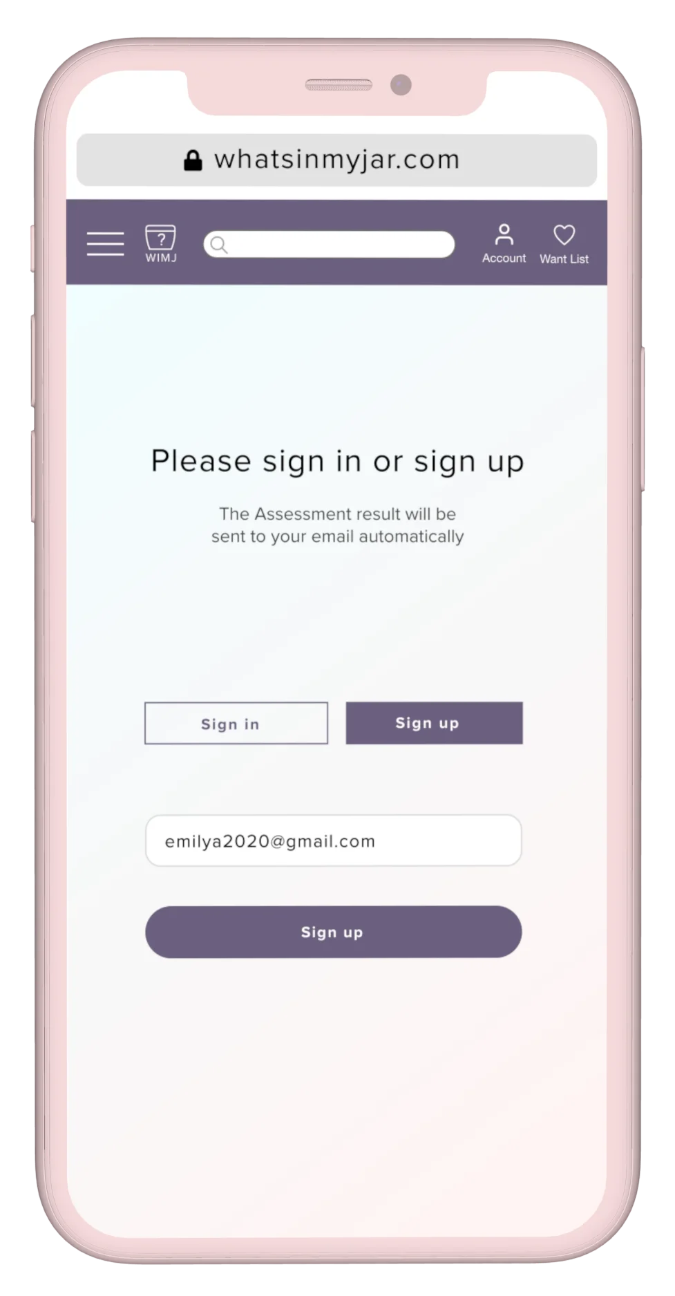
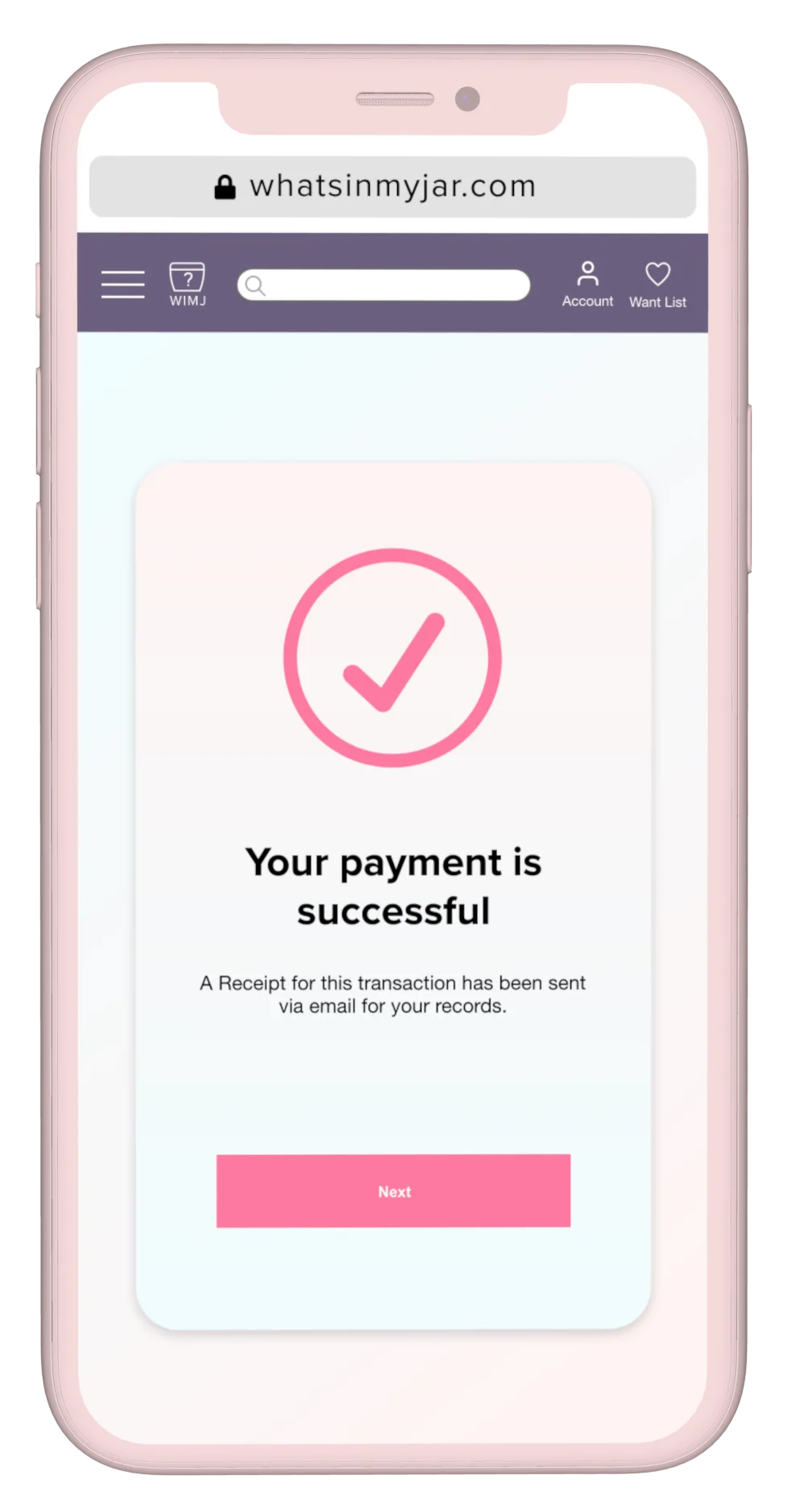
An overview of the product and UX improvements designed to support membership growth and create a better user experience.
Once the structure was defined, I explored the experience through sketches and wireframes before translating it into a polished, mobile-friendly interface. The final design balanced usability, accessibility, visual clarity, and the brand's personality.
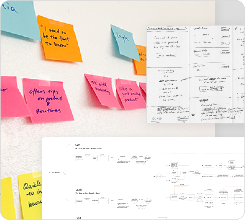
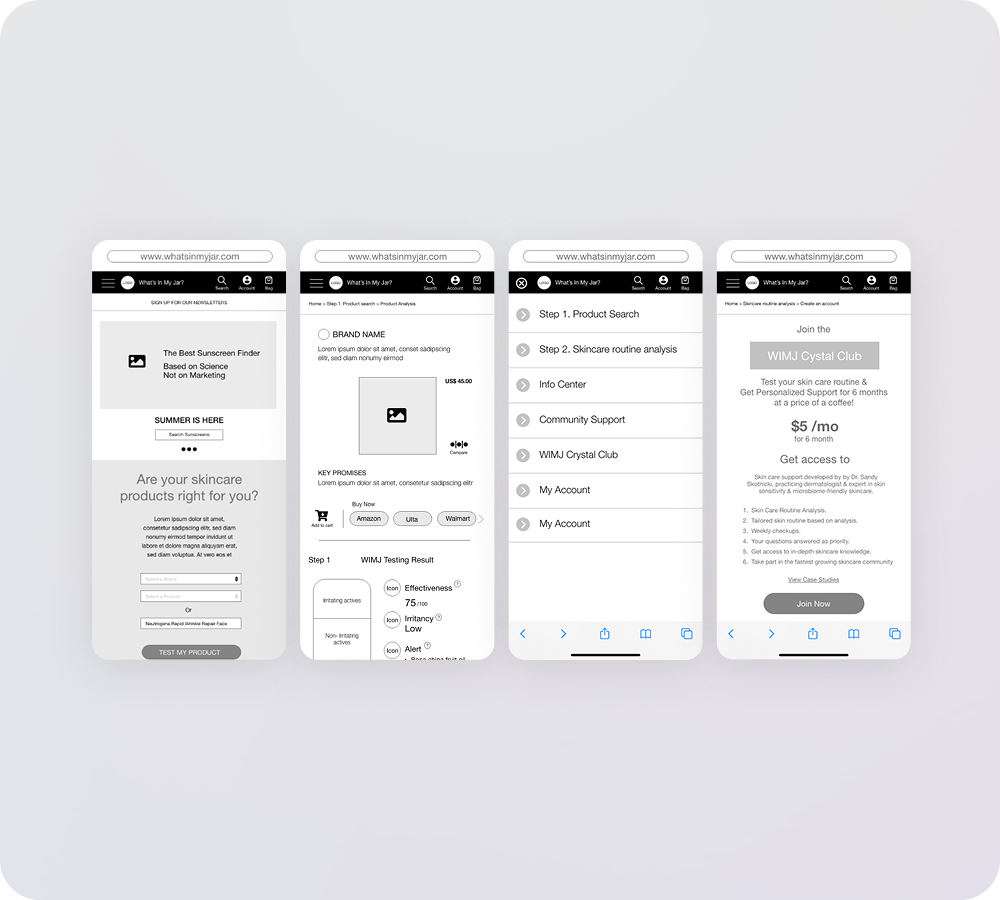
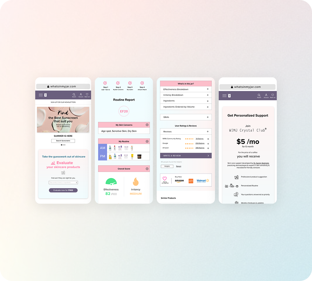
"Visual design wasn't decoration, it became the final layer that made the product easier to understand and more enjoyable to use."
I tested key flows with five recruited participants using interactive prototypes, gathering feedback on navigation, content clarity, and task completion. Multiple rounds of refinement simplified onboarding, clarified key actions, and created a more intuitive path from product discovery to membership.
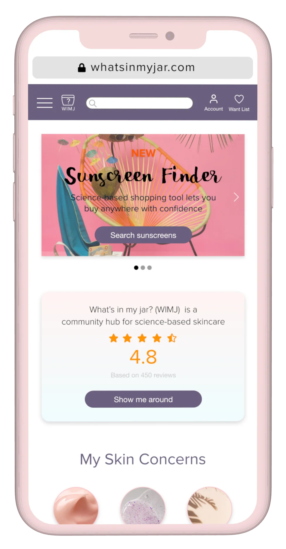
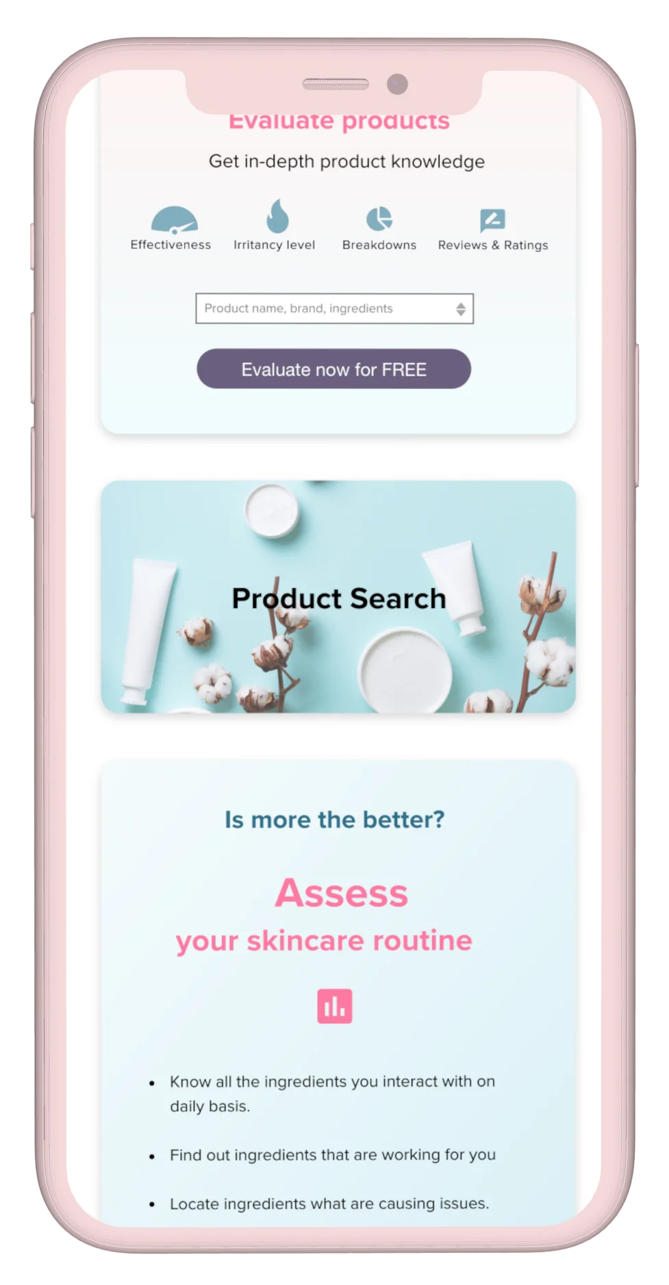
Thoughtful research and iterative design lead to better products, not just better interfaces.
User research replaces assumptions with evidence, helping teams make better product decisions.
Research turns user needs into product decisions that also support business priorities.
Each round of testing uncovered opportunities that strengthened both usability and clarity.
Clear hierarchy, language, and interaction cues reduce ambiguity and help users complete key tasks.